Here's another piece I did, I had to redesign a book cover using collage techniques. I chose Stephen King's Carrie.
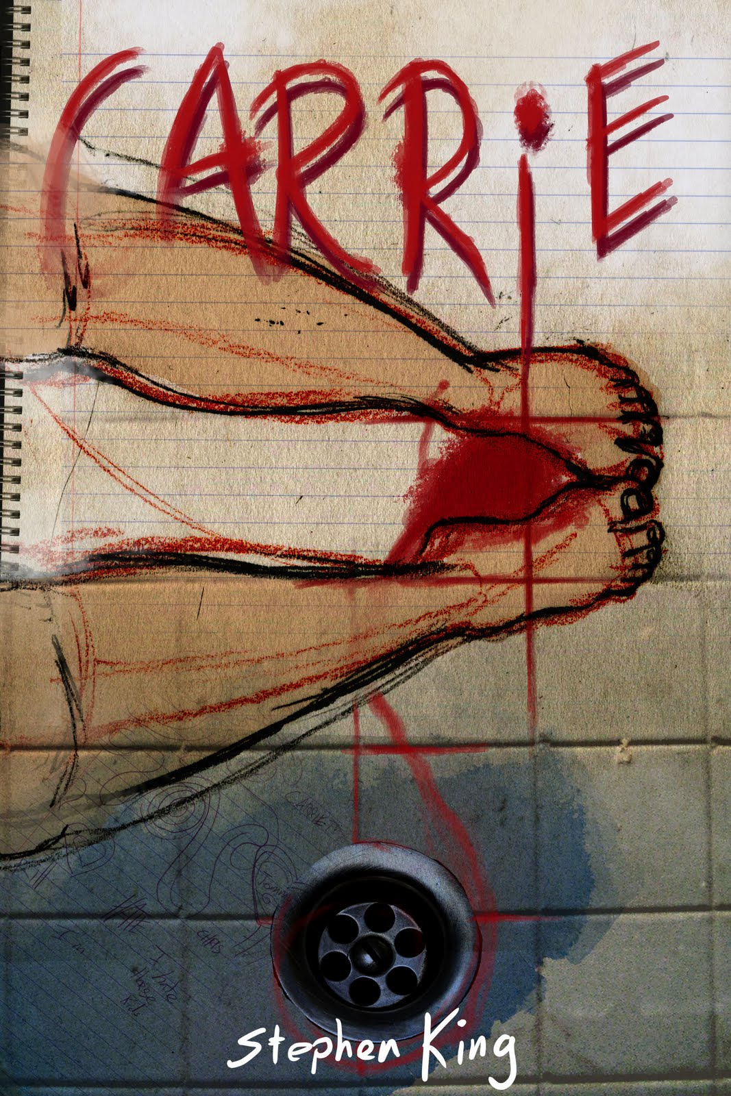
This was the final one I decided on.

These were the other versions I did that for different reasons didn't work. Just to show you how my ideas evolved working through the compositional elements of this piece.
Mock Up 1:

Doesn't work: Digital hand drawn text doesn't work well for the piece. A bit to linear. Composition lacking. Also Stephen King's name is too small.
Mock Up 2:
This one works better than the first. Turned the whole composition. Diagonals are more interesting to look at. Thats the good thing. Interesting elements, but they aren't working well together as yet. Text and image aren't interacting enough. Also while, it is bigger than the first, Stephen King's name could be bigger.
Mock Up 3:
This is close but no cigar yet. Stephen King's name is perfect. Changing the title's color to red, I thought would help link the blood in the image to the text, to make the text better interact with the illustration, it did to an extent, could still be better though, like I said close but no cigar. Further playing around with the composition would resolve the issue.
F
inal:
I decided to move the author's name to the top and the title at the bottom to see if this would make any difference, and I was quite happy with what happened. I chose this one as the final because I found the text interacted perfectly with the illustration. While I originally wanted "Carrie" to look like it was written on the notebook paper, I found in changing the text color to red, it would work equally well as if it were written in the blood on the floor. Also, moving "Stephen King" to the top produced a happy accident, in that the "G" engages the blood period (pun intended) much better than the title word "Carrie" did.